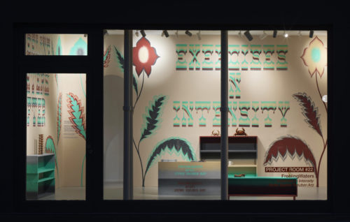
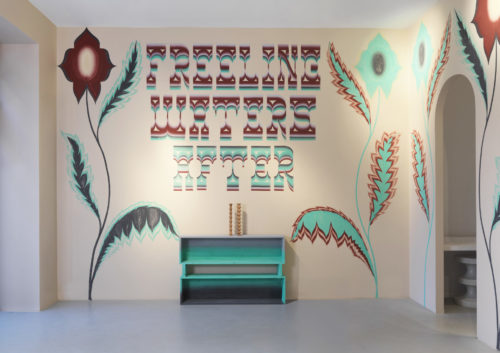
FreelingWaters turns color into a living, breathing organism, and in India Mahdavi’s Project Room their pigments behave like weather systems passing through furniture and walls. Water is never represented literally here, yet everything feels aqueous: gradients slide like tides across cabinets, and murals seep through the space until form appears to be suspended in a chromatic current. The title, “Exercises in Intensity,” borrowed from Sophie Taeuber-Arp’s own vocabulary, reads less as homage than as a method—colour as a daily discipline, a way of tuning the nervous system to a more liquid state of attention.
In this room, five pigments—Persian red, sea green, light ochre, light and dark grey—become the elements of a new climate. Each cabinet carries two hues bridged by a horizontal gradient, as if a shoreline were slowly being redrawn across its surface, refusing a fixed horizon. The boxes can be re-stacked, re-ordered, and re-aligned, so that every configuration performs a different tide: sometimes colours dissolve into each other, sometimes they collide, but the sense of movement never stops.
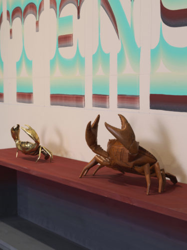
FreelingWaters—Gijs Frieling and Job Wouters—treat paint not as a coating but as a medium in the spiritual sense, transmitting layered rhythms they perceive in the world around them. Their practice, ranging from murals and ornamented cabinets to hand-painted textiles and lettering, is grounded in the slow alchemy of pigment and binder, each mixture adjusted to its surface like water to its container. With a team of assistants, they scale this intimacy up to architectural proportions, allowing ornament to flood ceilings, walls and objects with the same attention normally reserved for a single brushstroke.
Sophie Taeuber-Arp hovers like an underwater current beneath the project, a role model whose work slipped effortlessly between tapestry, furniture, murals and sculpture, between modernism and ornament. Her own “exercises in intensity” were chromatic experiments; here, that research is extended into a spatial, tactile experience, where colour is no longer a backdrop but a force that defines form, erodes it, and occasionally drowns it altogether. In this aqueous architecture of pigment, furniture becomes reef, mural becomes tide, and the visitor moves through a quiet storm of colour that never quite decides where surface ends and depth begins.