Dear Shaded Viewers,
The following are excerpts pulled from the interview between Takahiro Miyashita and Junsuke Yamasaki:
What was your concept behind the “RE:” collection?
I am still questioning the meaning of “RE:”. It is thesis and antithesis at the same time. It is about freedom and restraint at the same time. It is unanswerable and questionable. It is an update to the both past and now and that attitude is reflected in the collection. It is the beginning and the end, and I somehow come and go in between.
When asked about the developing process and sustainability, here is an excerpt:
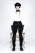
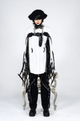
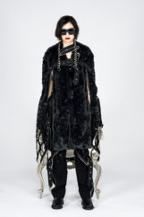
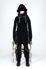
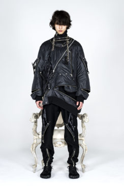
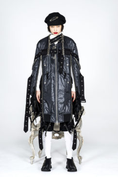
During the pandemic, my urgency to keep pushing my creativity and evolving garments was very much alive. Every season, when working on the collection, certain films and music appear in my mind. This season, it was the film about The Beatles, “Help!”. I thought of the circumstance surrounding the band during its filming, and especially John’s look in the film was quite memorable for me. At the height of the band’s success, I guess they must have been extremely busy but at the same time they seem to be having a lot of fun. I think they were freely doing everything they wished for but rarely had time for their own thus could have been quite suppressed too. This led me to come at the concept of “The Beatles suppressed”. In my collection, set against the strict rules of the musical score, garments in pencil silhouette move freely between lines and create a beautiful melody. When worn as a two-piece suit there are 5 belts and they were inspired by the musical score.
Layering, zipper details, detached mesh pockets…, can you tell us about the styling?
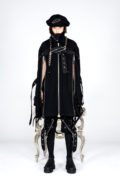
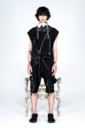
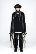
Detached cage pocket details was to say “we can now go free”. Inspired by the film, “Help!” there is a cape like jacket, and although they have sleeves and you can slide your arms in, you can’t move. Basically, an unusable arm! Why? It was important for sleeve details to be that way for me to convey the message.
Can you tell us about the original font you created for the collection?
It was based on Gothic fonts and Morse Code. I made some adjustment to harmonize with the collection. It was not intended to be just a classic but rather what could be a new style of Gothic. My attitude was to respect the original but to update. It is hard to read thus it encourages viewers to look and think harder to understand.
This season’s film seems to have different quality compared to last season’s. What has changed? Is making garments and film different to you?
This season, it is more formally a film. It was like changing gear to top speed, and I can’t seem to stop creating now. For me to do one thing or two isn’t much different. To create is to create, and visuals, sounds, and garments all appear spontaneously in my mind.

